


Apple iPad Ad Backlash
Apple iPad Ad Backlash
What's wrong with all the hate around it

Hi friends,
When Andrea mentioned the news yesterday, I was a bit skeptical about whether to talk about it - online controversies aren't my thing.
But when I saw Apple actually apologizing for the ad, I realized things had gotten out of hand, and I had to write my two cents about it.
Putting aside the chatter, I want to point out two campaigns and a design project that are all about minimalism, strong insights, and cutting the fluff.
Have a good read.
ADVERTISING
Why all the hate for Apple's new ad? Let's “Crush” the Backlash

In Apple's latest iPad Pro commercial, featuring various items being crushed to showcase the device's creative capabilities, got people all riled up on social media. Despite its slick execution, folks are saying it's a sign of us heading into a soulless, all-digital age at the expense of human creativity and tangible art. Everyone from celebs like Hugh Grant to the creative crowd has weighed in, flooding LinkedIn and X with posts, creating a massive shitstorm for Apple (the first time ever, at least, as far as I can remember), and forcing them to apologize publicly. Someone found this simple solution to fix it (props to Curro for that gem). Usually, I don't dive into this stuff, but I'm vibing with Machado's take (Andrea's tips always on point).
ADVERTISING
The Ordinary: where science meets skincare revolution
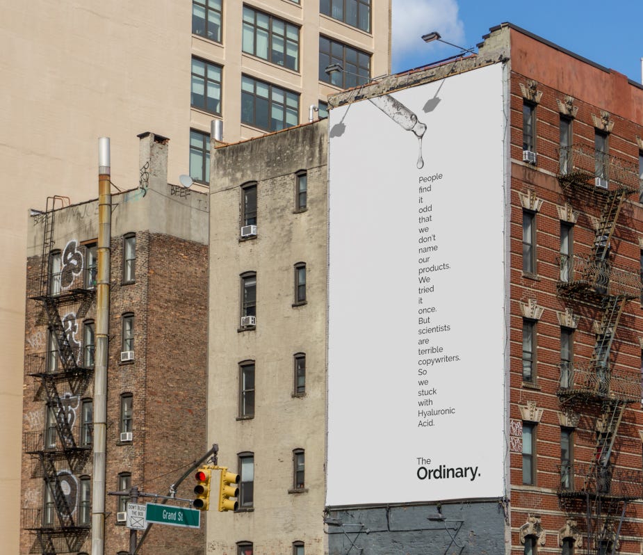
The skincare brand The Ordinary is making waves in the beauty industry by prioritizing science over celebrity endorsements. Their latest campaign, created in partnership with Uncommon Creative Studio, focuses on simplicity and transparency in their messaging. By offering high-quality products at affordable prices and educating consumers on ingredients and their benefits, The Ordinary is changing the perception of the beauty industry.
FEATURED
A bunch of news from my network
- Nuova Scena will come back with a second season [source Nicola Conati linkedIn]
- Satispay presents the new brand identity [source Elisabetta Cavanna linkedIn]
- Glovo signs a brand new partnership with Spotify [source Nicoletta Vona linkedIn]
- Diageo launches Venturo, Aperitivo Mediterraneo [source Alessia Palmieri linkedIn]
- Al.ta Cucina fines in the Cibus parking lot [source Simone Mascagni linkedIn]
- Brunello Cucinelli launches new fragrances in Hong Kong [source Antonio Stasolla linkedIn]
NOBODY READS ADVERTISING
People read what interests them, and sometimes it’s NOT an Ad
Let's jump in something out of the bubble:
Fun fact: What food product came out the Year you were born?
Pills for geeks: 15 things you didn’t know your iPhone could do
Foodies bites: How much ultraprocessed food are you eating?
Infomaniac: The World's top Media franchises by all-time revenue
Travel Tidbits: The 25 most exciting places around the world to visit next
JOB POSTING
The wrong place to find the right job
- Serenis is looking for a Senior Engineer [through Silvia Wang]
- Smartpricing is searching for a Head of People[through Giuseppe Lacerenza]
MARKETING
Mktg picks not to miss
- Lululemon leans into pickleball with Life Time partnership
- Instagram beats TikTok for video-based user acquisition, survey finds
- Uber swings to loss despite rising revenue
ADVERTISING
Mike's Awkward Bluff: the wake-up call on BINGE

In the latest installment of 'I Saw It on BINGE', Australia's entertainment hub, the narrative revolves around Mike's uncomfortable encounter at a wake where he struggles to conceal his ignorance of the latest trending show. The campaign, created by Thinkerbell, emphasizes the social importance of staying updated with popular entertainment, portraying the consequences of being out of the loop.
DESIGN
Resident Revitalized: how Vanderbrand's human-centric approach transformed Plaza Partners
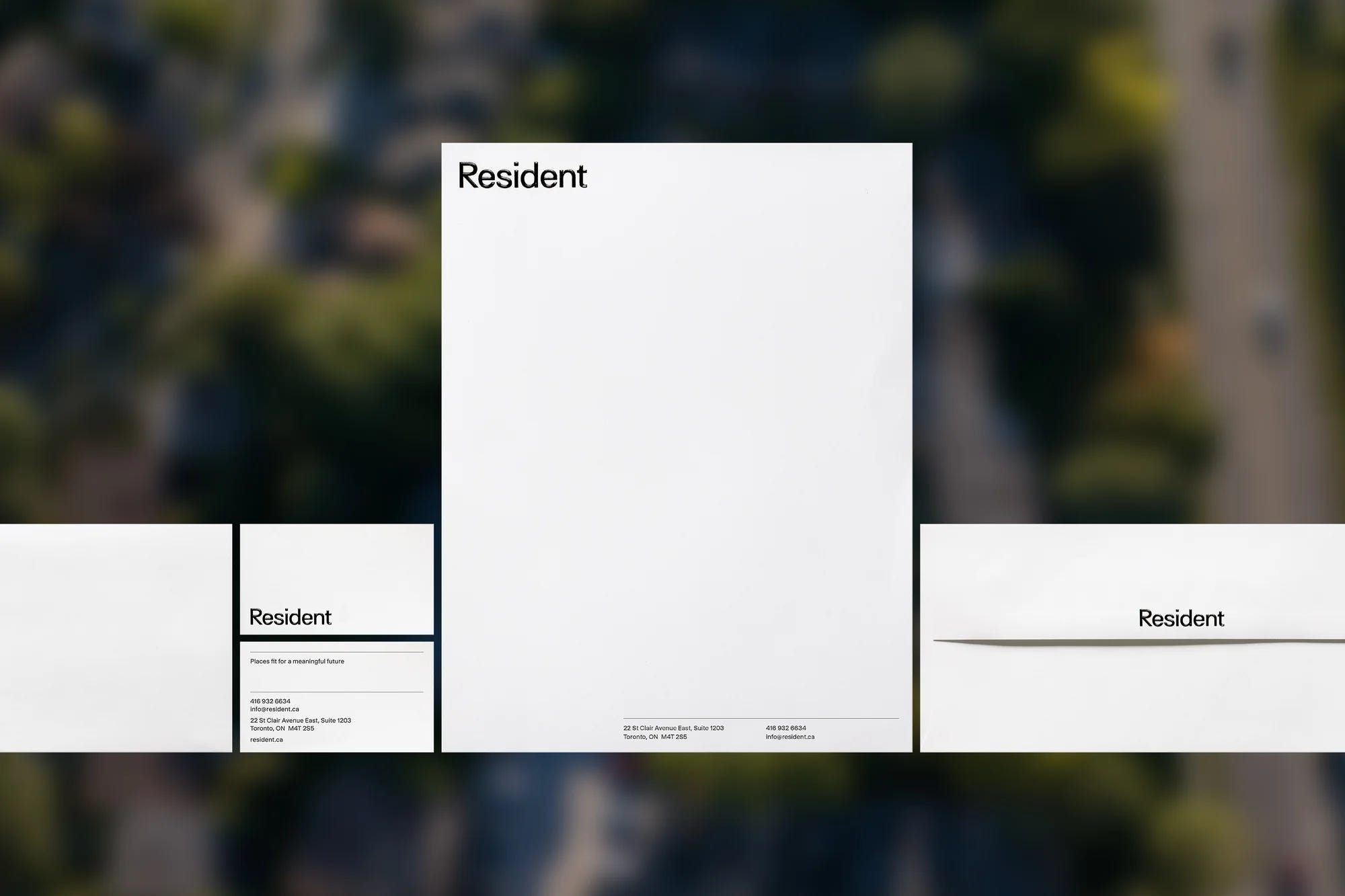
Vanderbrand, a Toronto-based creative agency, has spearheaded a comprehensive rebranding effort for real estate company Plaza Partners, now known as Resident. The rebranding aims to reflect the company's commitment to creating liveable communities by emphasizing a people-first approach. The new wordmark and identity, developed by Vanderbrand, embody a minimal yet authentic aesthetic, capturing Resident's ethos in a precise and distinctive manner. The use of Surt and Selecta typefaces and a black-and-white palette ensures immediate recognition and flexibility, allowing the brand to evolve and resonate with various neighborhoods and residents.